Overview

Transforming Ozone House's Digital Presence for Greater Impact

Ozone House is a nonprofit organization dedicated to supporting at-risk youth and their families by providing safe housing, crisis intervention, and supportive services.By streamlining navigation, enhancing content clarity, and prioritizing user-centered design, the project aims to make vital resources and services more easily accessible.

Background

Creating a Donor-Centric Digital Experience

Creating a Donor-Centric Digital Experience

Creating a Donor-Centric Digital Experience

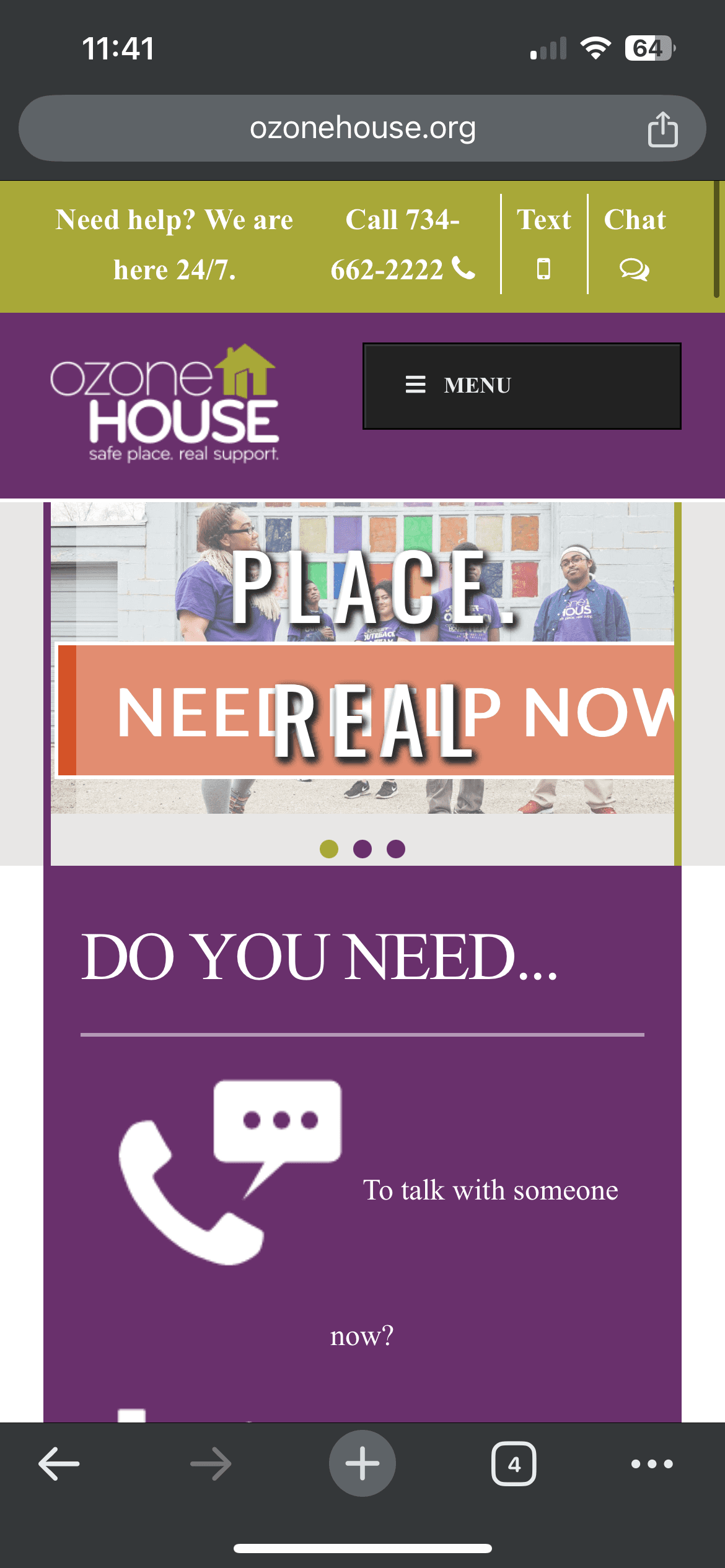
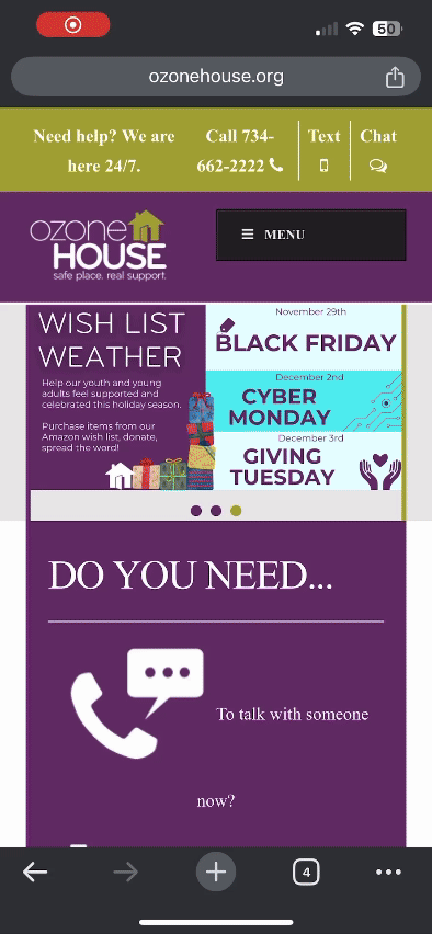
Ozone House is a nonprofit organization dedicated to supporting at-risk youth and their families through services like housing, counseling, and crisis intervention. However, the website presented challenges for potential donors, with unclear navigation and accessibility issues that made it difficult to find key information and contribute effectively.

Problem

Navigational and Accessibility Issues prevent Users from achieving their goal

Navigational and Accessibility Issues prevent Users from achieving their goal

Navigational and Accessibility Issues prevent Users from achieving their goal


Ozone House’s website faced significant accessibility challenges, including typography and color choices that made important text difficult to read. Low-contrast text and colors reduced readability, especially for users with visual impairments. These design flaws made it harder for users to access critical information, limiting the site’s effectiveness

Research

Understanding the User

User Personas

The user personas represent potential donors for Ozone House. These personas highlighted key needs, such as quick access to crisis support, clear navigation to resources, and an inclusive design that accommodates users with disabilities.

Solution

Solution

Solution

Improve accessibility through typography, color, and hierarchy

I simplified the typography by reducing the five mismatched fonts to two complementary choices: a sans-serif for body text and a serif for headings. This change enhanced readability and created a consistent visual experience.

I also addressed color contrast issues by selecting a more accessible palette, ensuring text met WCAG standards for users with visual impairments.

Finally, I refined the visual hierarchy, using clear headings and spacing to guide users intuitively through the content, making critical resources easier to find and read.

Final Design

Unlocking Grades: A Student's Journey Through the my.emich.edu Portal

Reflection

Learning from the Process

This project taught me the crucial role accessibility plays in web design. Small adjustments, like improving typography and color contrast, can significantly enhance user experience. I learned that accessible design isn’t just about meeting standards but about creating an inclusive experience. This process highlighted how important it is to design with empathy, especially when supporting causes like Ozone House, where accessibility directly impacts donor engagement and support.